T
u
r
k
'
s
T
a
c
o
s
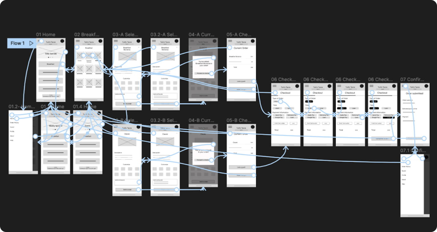
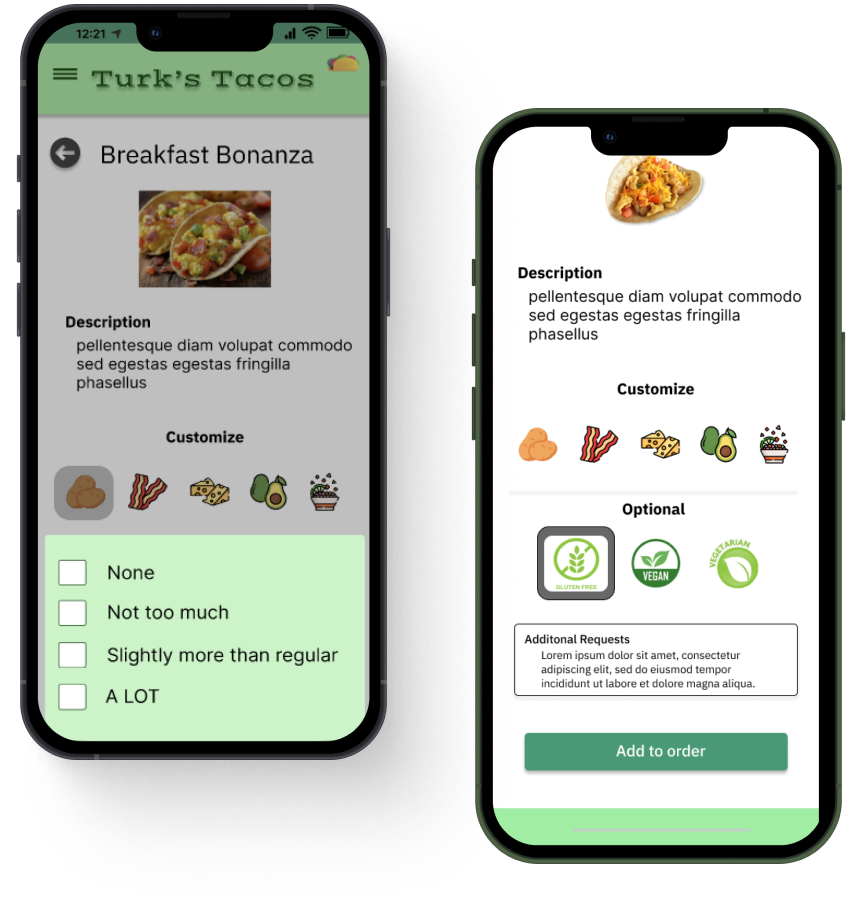
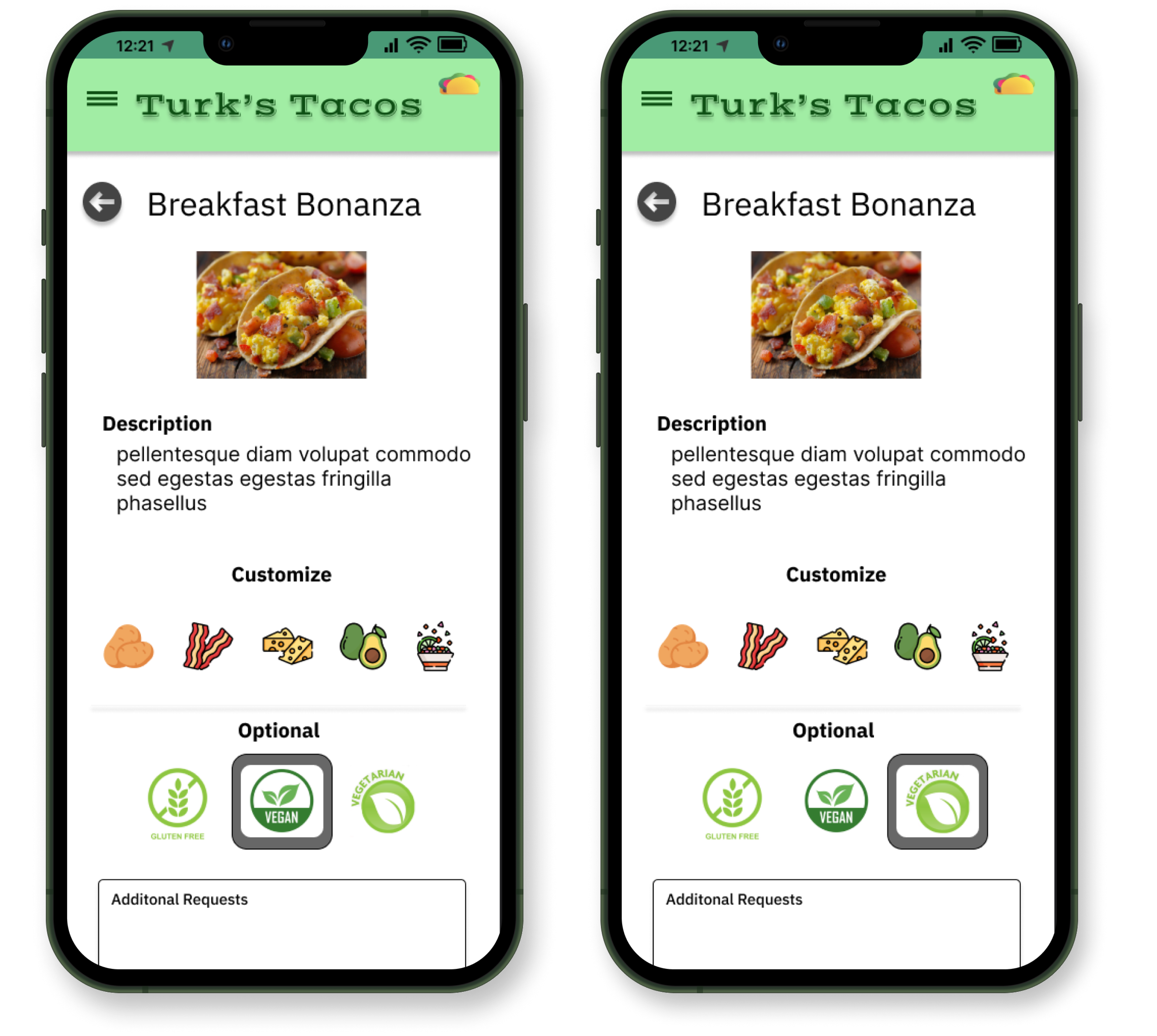
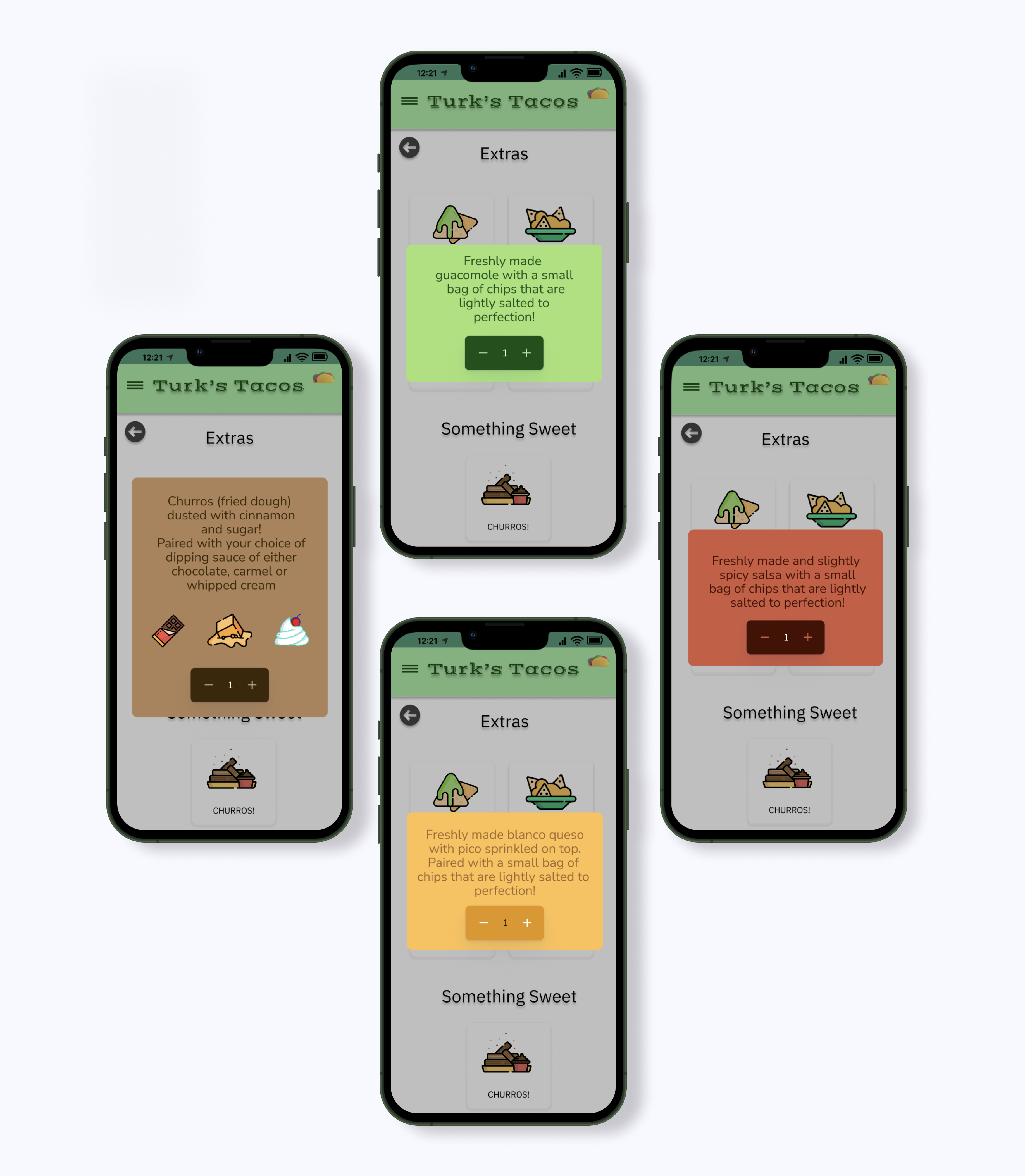
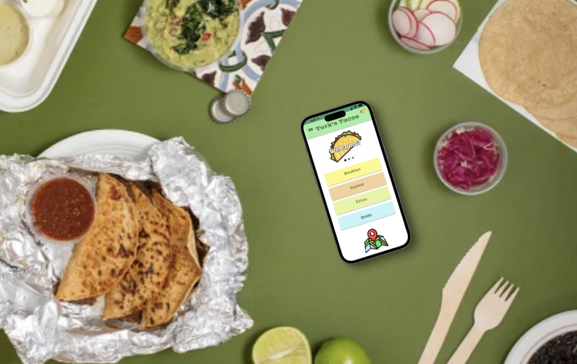
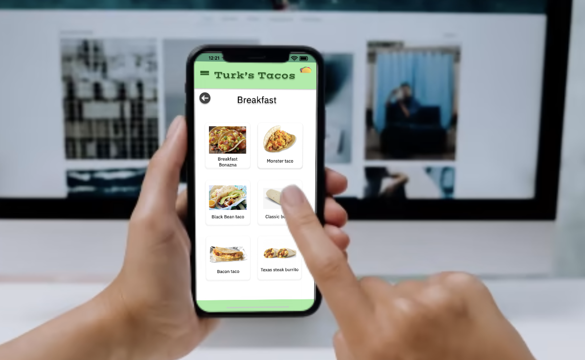
Mobile App Design
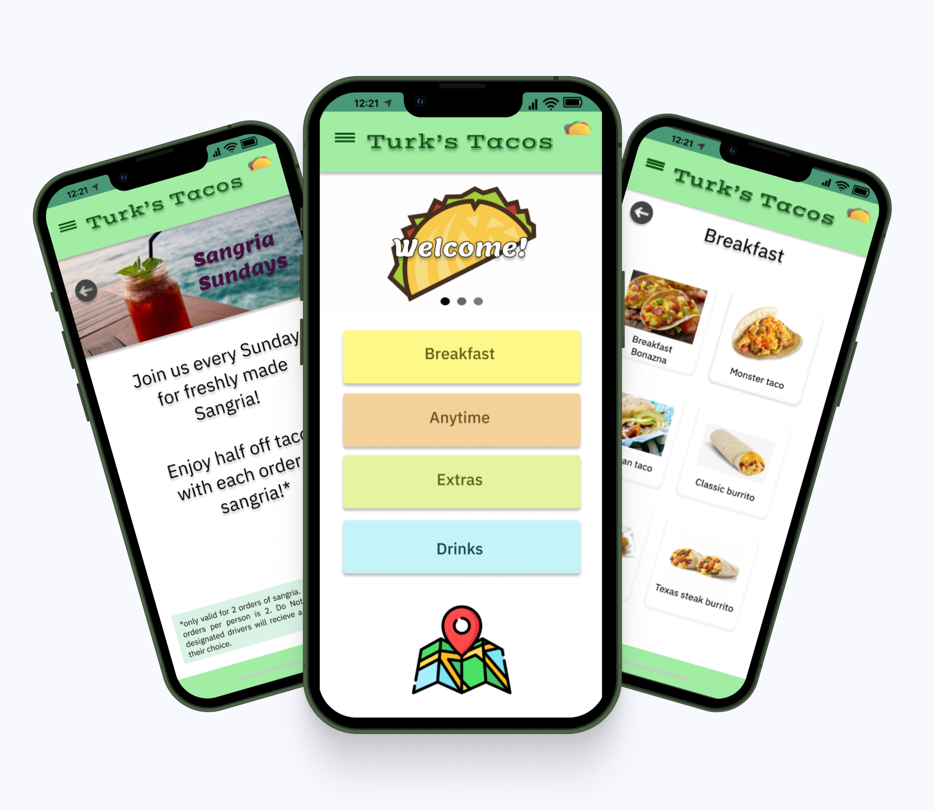
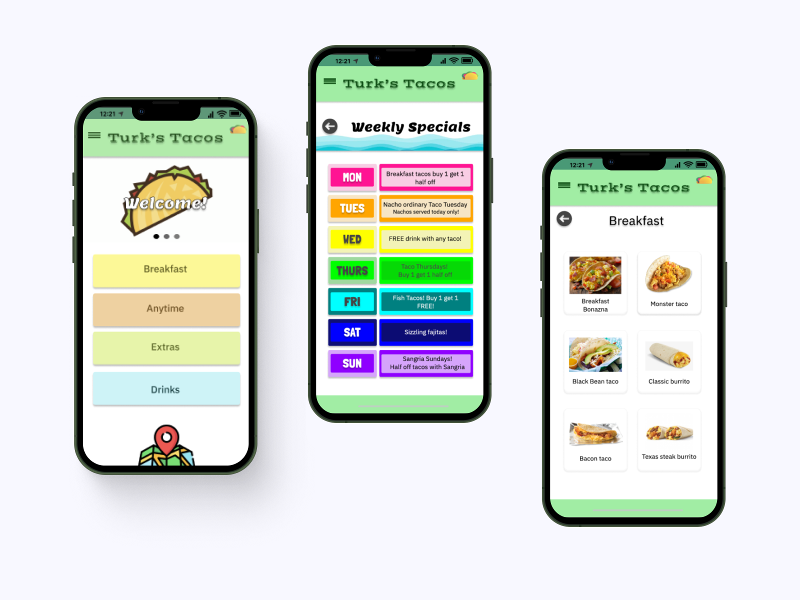
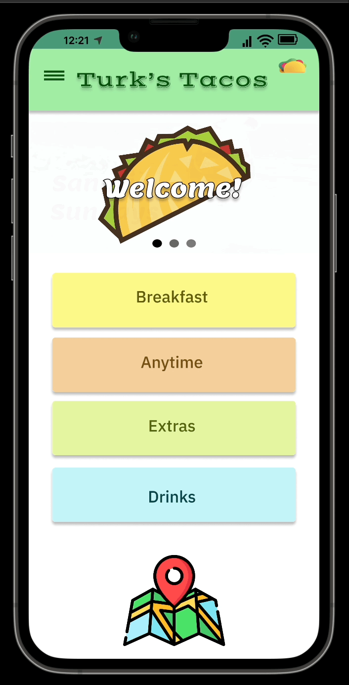
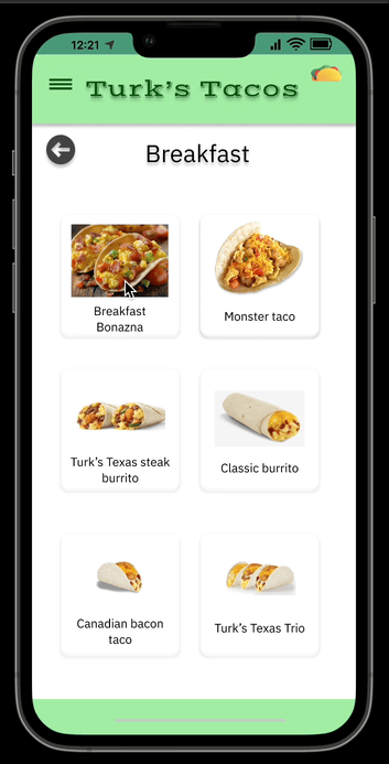
We're not your typical taco truck...
We're an everything you want & more truck!
From the break of dawn to late night munchies,
We got you covered for anything & everything in between!
Anytime is Taco Time!
.jpg)
.jpg)

.png)
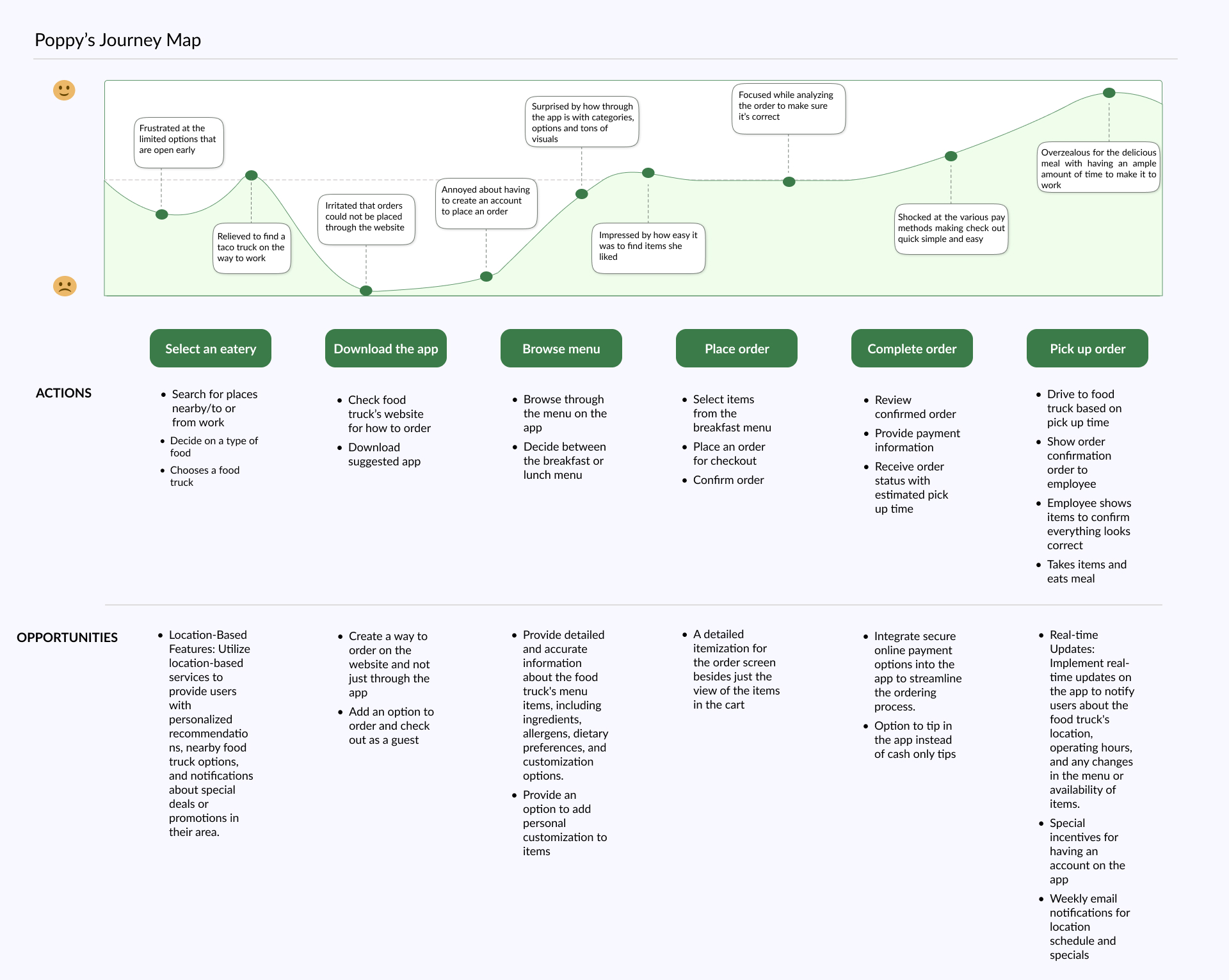
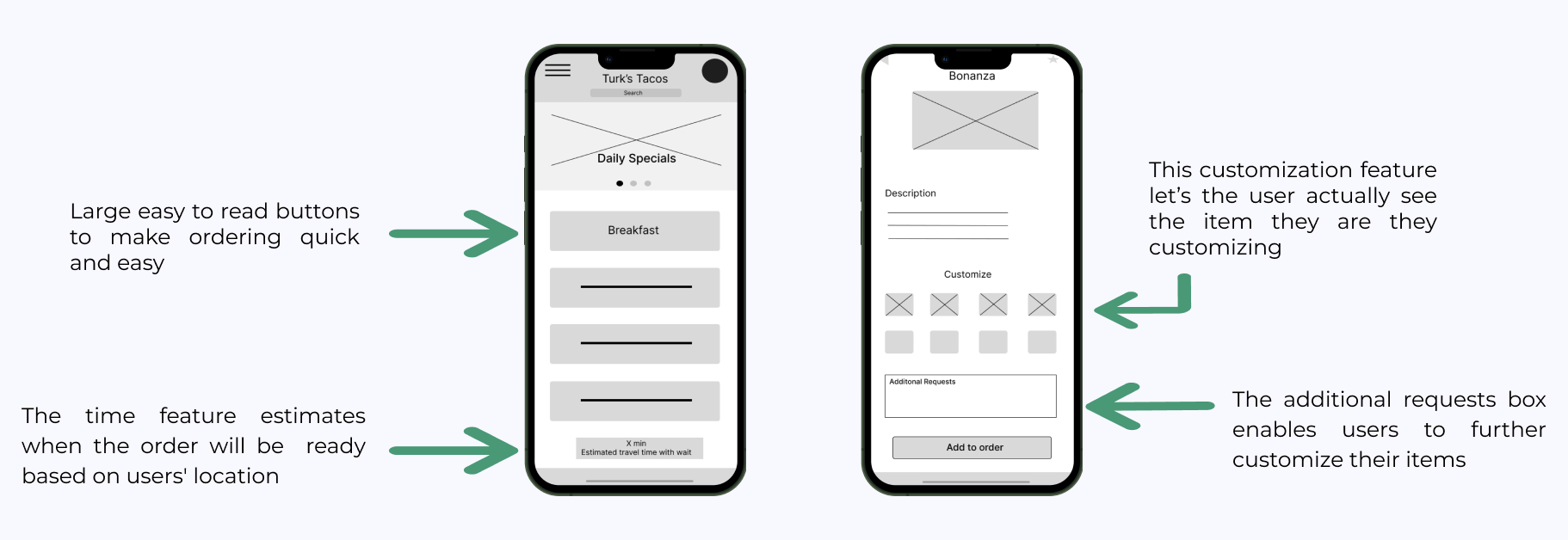
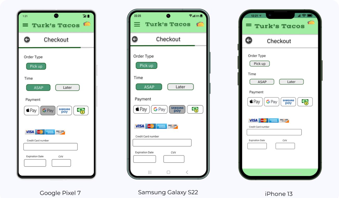
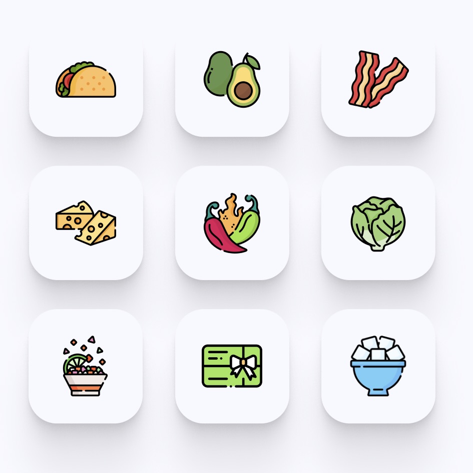
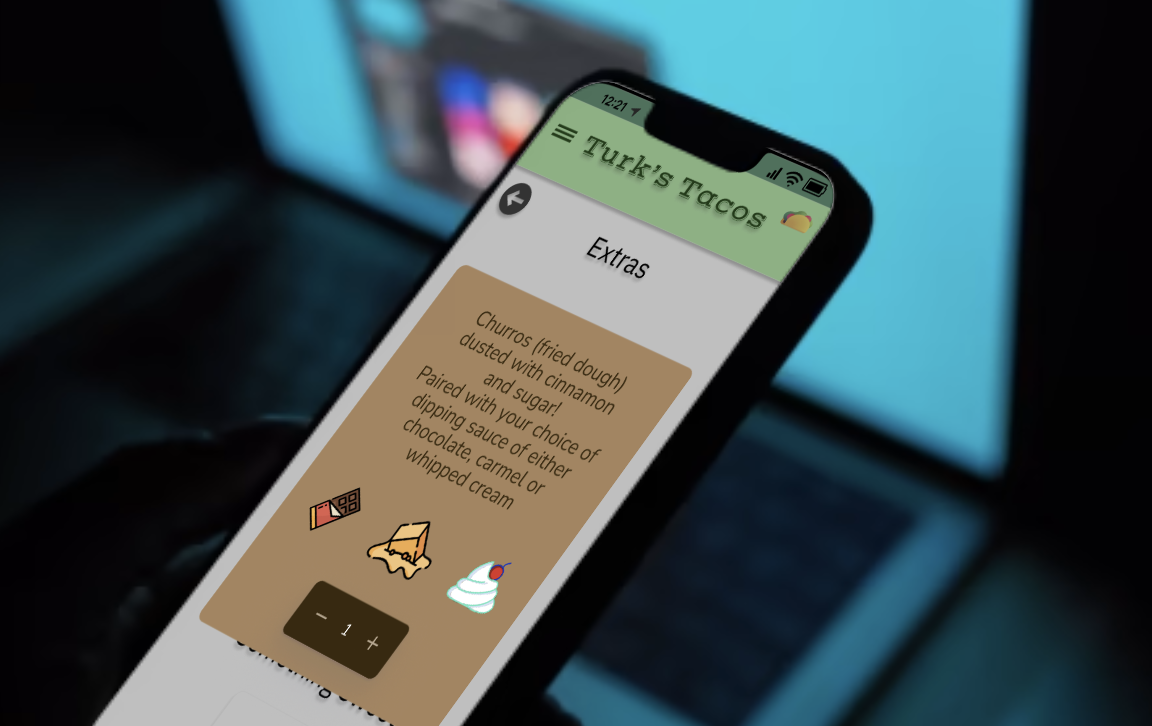
In-direct competitors offer varying degrees of usability in their platforms.
Accessibility issues such as poor typography and color schemes are common.
.jpg)
.jpg)
.png)
.jpg)
.jpeg)
.jpg)