T
r
o
p
i
c
o
f
S
u
m
m
e
r
Botanical Garden and Flower Shop
Responsive Web Design
Where petals delight,
Whispering secrets in colors so bright.
Blooms that enchant,
With charm and cheer.
The Earth laughs in flowers,
Come find joy here.
.jpg)
Where petals delight,
Whispering secrets in colors so bright.
Blooms that enchant,
With charm and cheer.
The Earth laughs in flowers,
Come find joy here.
Where petals delight,
Whispering secrets in colors so bright.
Blooms that enchant,
With charm and cheer.
The Earth laughs in flowers,
Come find joy here.

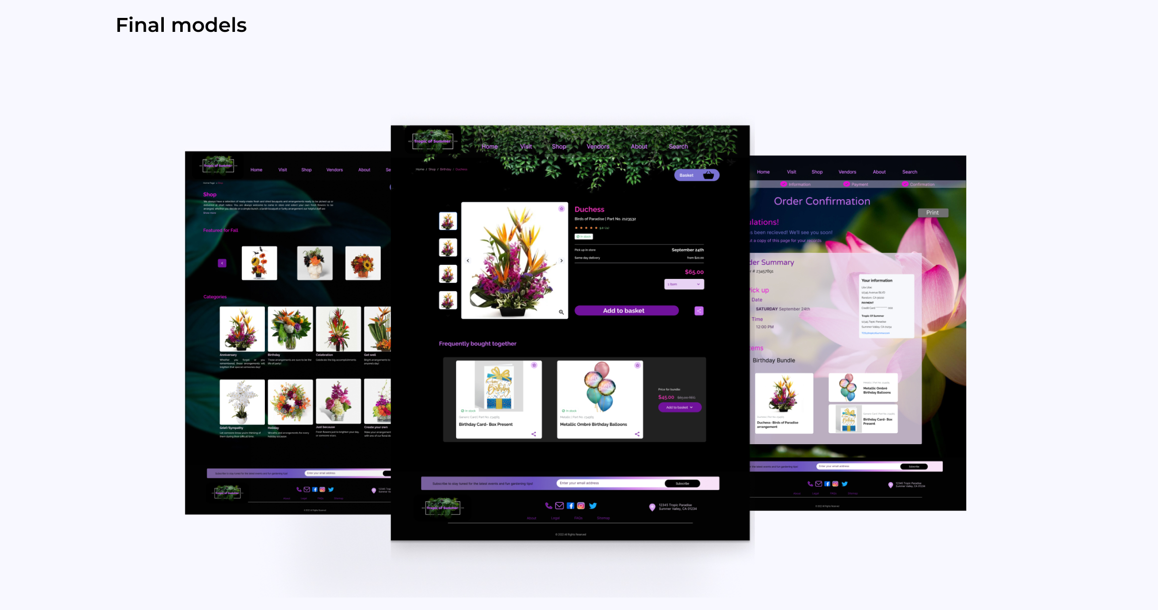
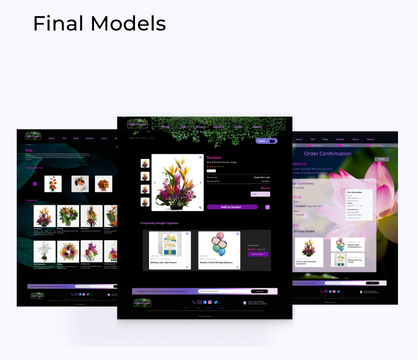
This is the challenge Tropic of Summer, a renowned botanical garden and flower shop, now faces.
With a reputation for stunning floral arrangements and diverse plants, their website needs to match the elegance of their offerings.
However, the current browsing experience leaves customers frustrated, making it hard to find what they need.
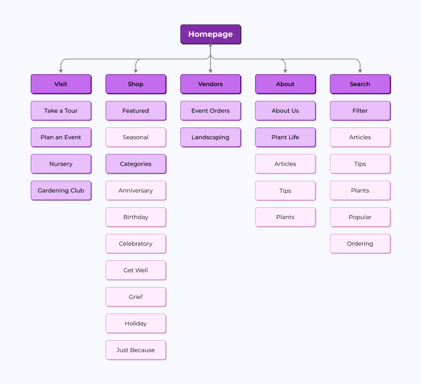
To solve this, Tropic of Summer is embarking on a research project to streamline their website layout and enhance navigation, ensuring a seamless and enjoyable shopping experience that mirrors their in-store charm.
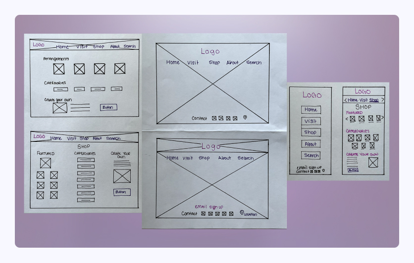
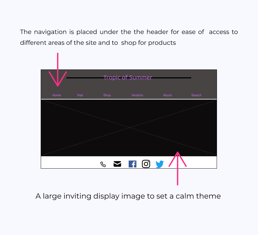
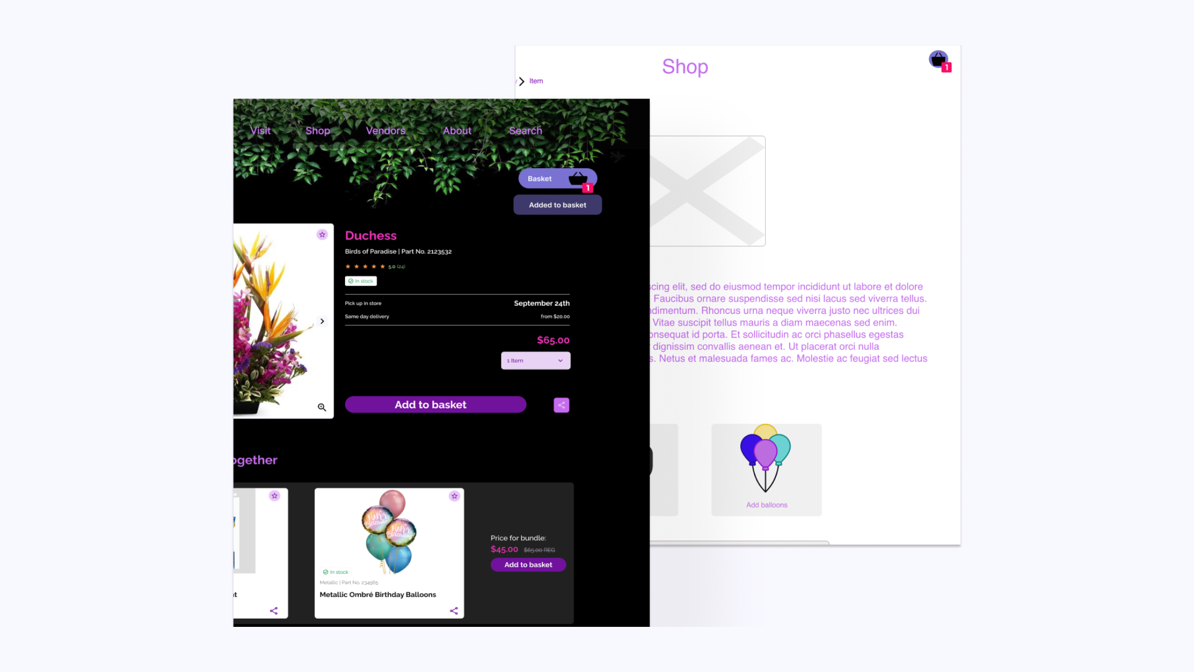
Tropic of Summer prioritized a user-centered design approach, focusing on the needs and preferences of their customers. This involved conducting user research, including surveys and usability testing, to understand pain points and gather feedback on existing website issues.
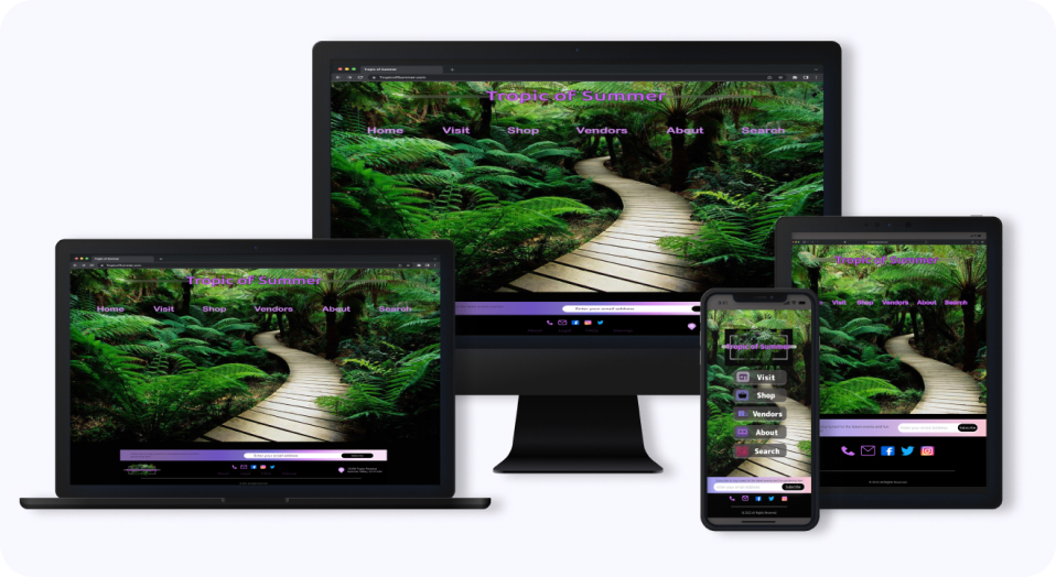
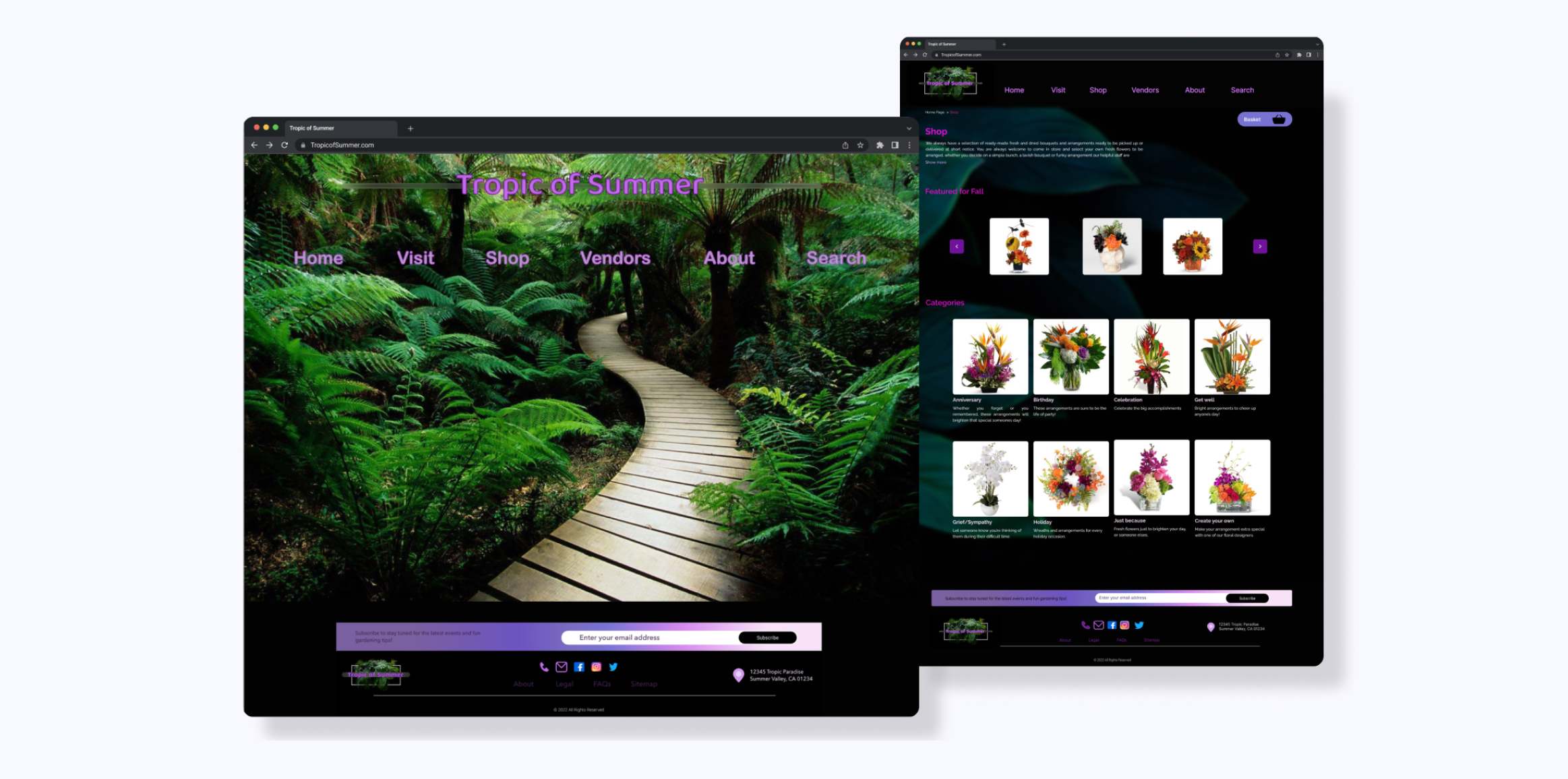
Recognizing the importance of mobile shopping, Tropic of Summer ensured that the redesigned website was fully responsive. This adaptation provided a consistent and user-friendly experience across all devices, from desktops to smartphones.
Post-launch, Tropic of Summer committed to continuous improvement by monitoring website performance, analyzing user behavior, and implementing regular updates based on customer feedback.
Tropic of Summer prioritized a user-centered design approach, focusing on the needs and preferences of their customers. This involved conducting user research, including surveys and usability testing, to understand pain points and gather feedback on existing website issues.
Recognizing the importance of mobile shopping, Tropic of Summer ensured that the redesigned website was fully responsive. This adaptation provided a consistent and user-friendly experience across all devices, from desktops to smartphones.
Post-launch, Tropic of Summer committed to continuous improvement by monitoring website performance, analyzing user behavior, and implementing regular updates based on customer feedback.


.jpg)
.jpg)
.jpg)